Overview
Introduction
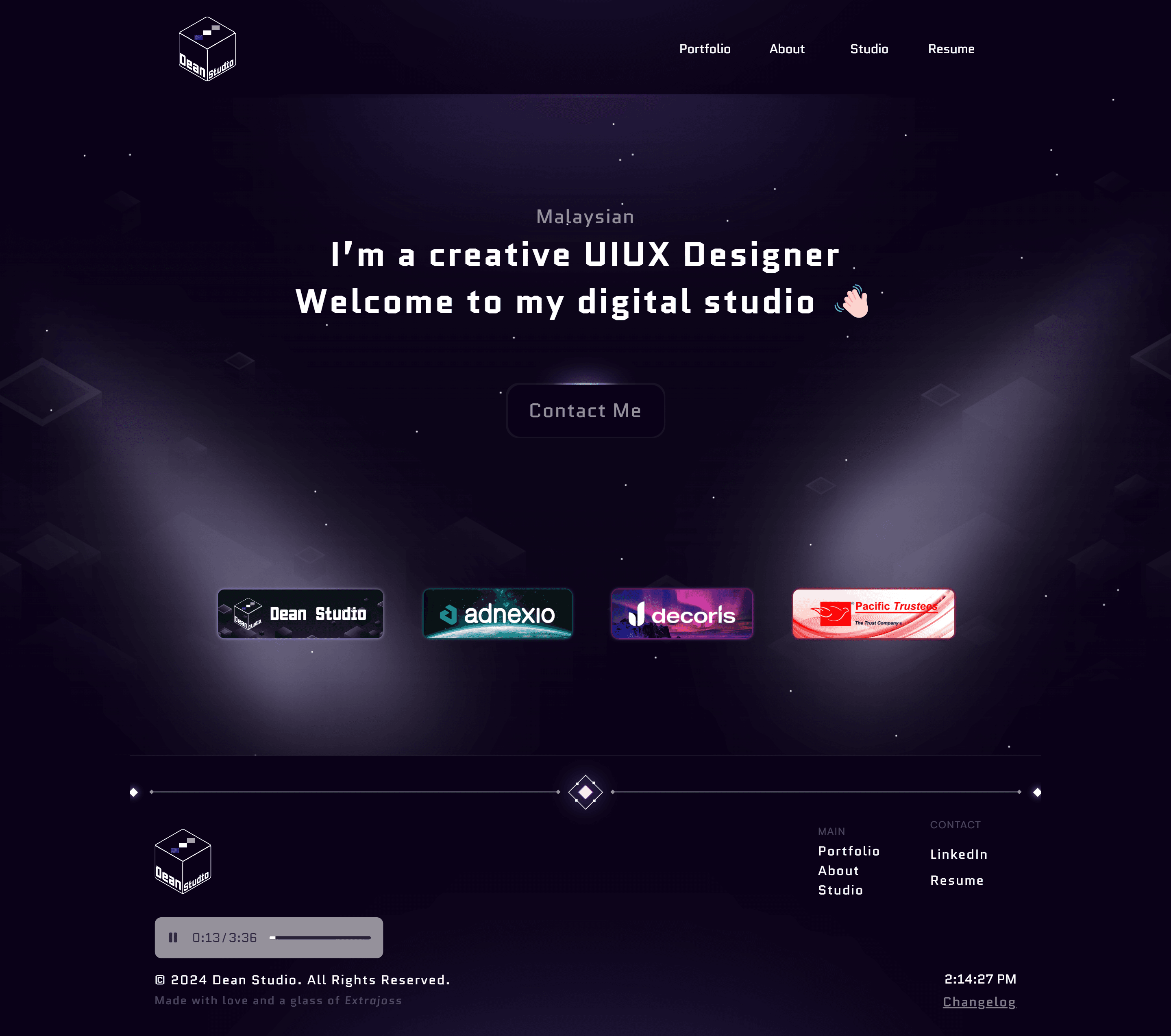
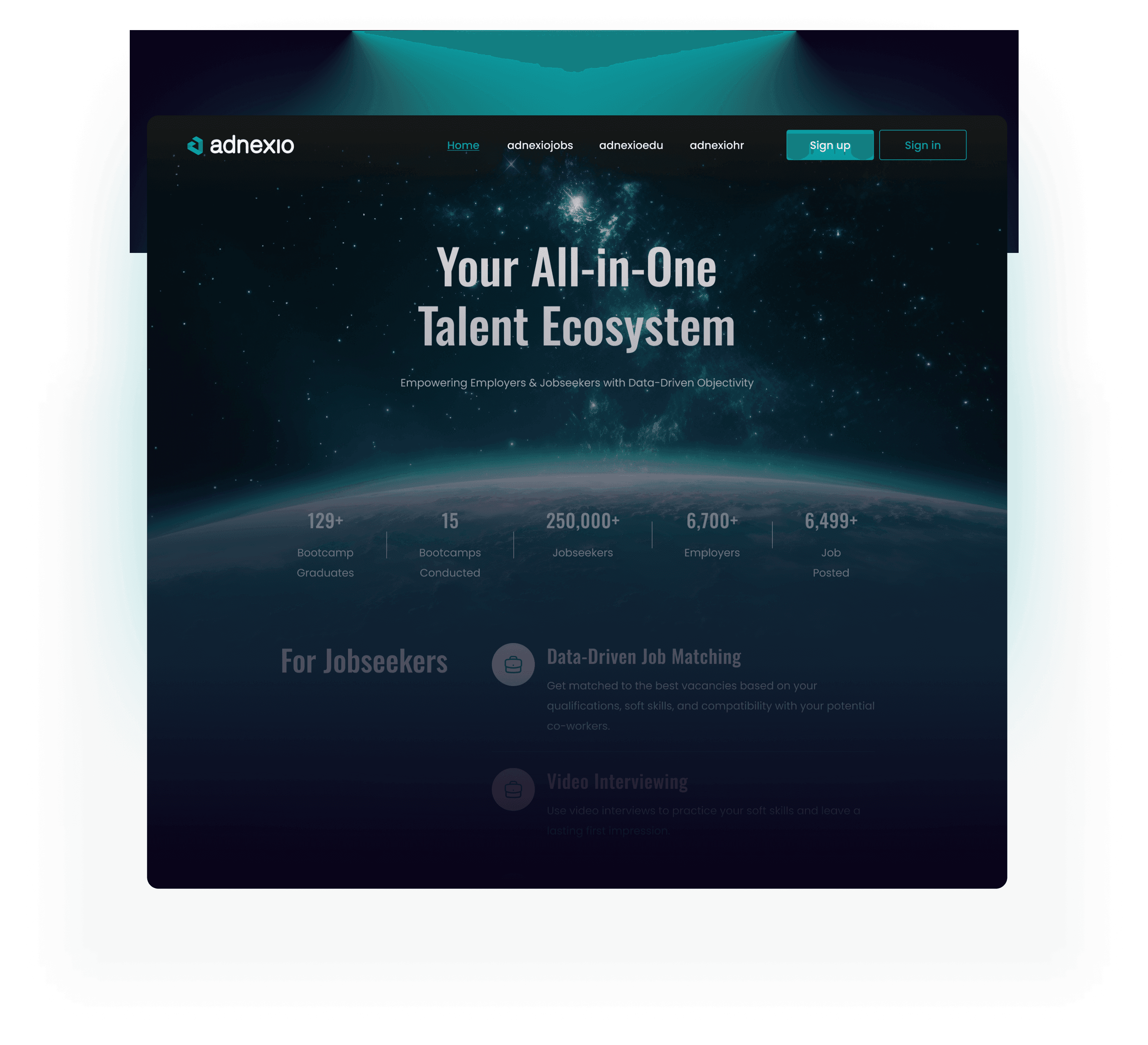
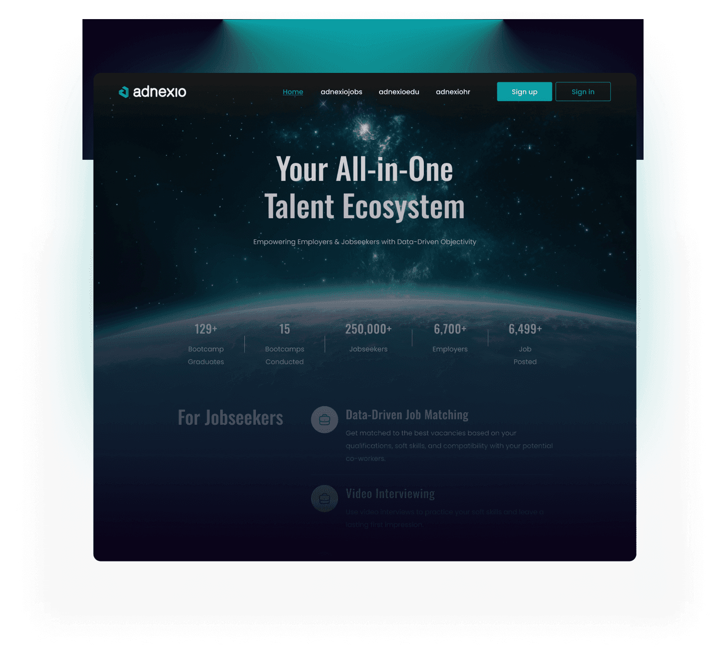
Adnexio, the future of talent acquisition and development in Malaysia. This innovative platform unifies HR management, job discovery, and career advancement tools into a seamless user experience.
Adnexio are split into 3 products, AdnexioHR, AdnexioJobs, AdnexioEDU.
Team & Timeline
Ahmad Rafiuddin
Design Lead
My Role
UIUX Designer
Aimi Nadila
Project Manager
Irsyad Murtadha
Backend Developer
Norshaffan Mohd
Frontend Developer

Daily Sprint Meeting
Summary of the discussion between our team, 3 points were highlighted:
Solution
Design Process
Research
Understanding the core product
Since its a revamp, it is important to understand the core feature of the base product. Therefore i analyse the currently available features before making my decision.
Core features
Admin (HR)
Approval Centre: Claims, leave, overtime, reimbursement.
Staff management
Payroll
Yearly Report
Appraisal
User (Employee)
Requester: Claims, leave, overtime, reimbursement
New Feature
Upskill
New feature “Upskill” for users and “Upskill Progression” for HR to monitor employee’s progression regarding upskilling.
Admin (Upskill Progression)
Manage and oversee the entire upskilling process.
Add or remove bootcamps and courses
Set approval workflows for employee course applications.
Set approval workflows for employee course applications.
Track employee progress and completion rates
User (Upskill)
Browse available bootcamps and courses aligned with their career goals.
Submit applications for chosen programs.
Easily track the status of their applications and course progress.


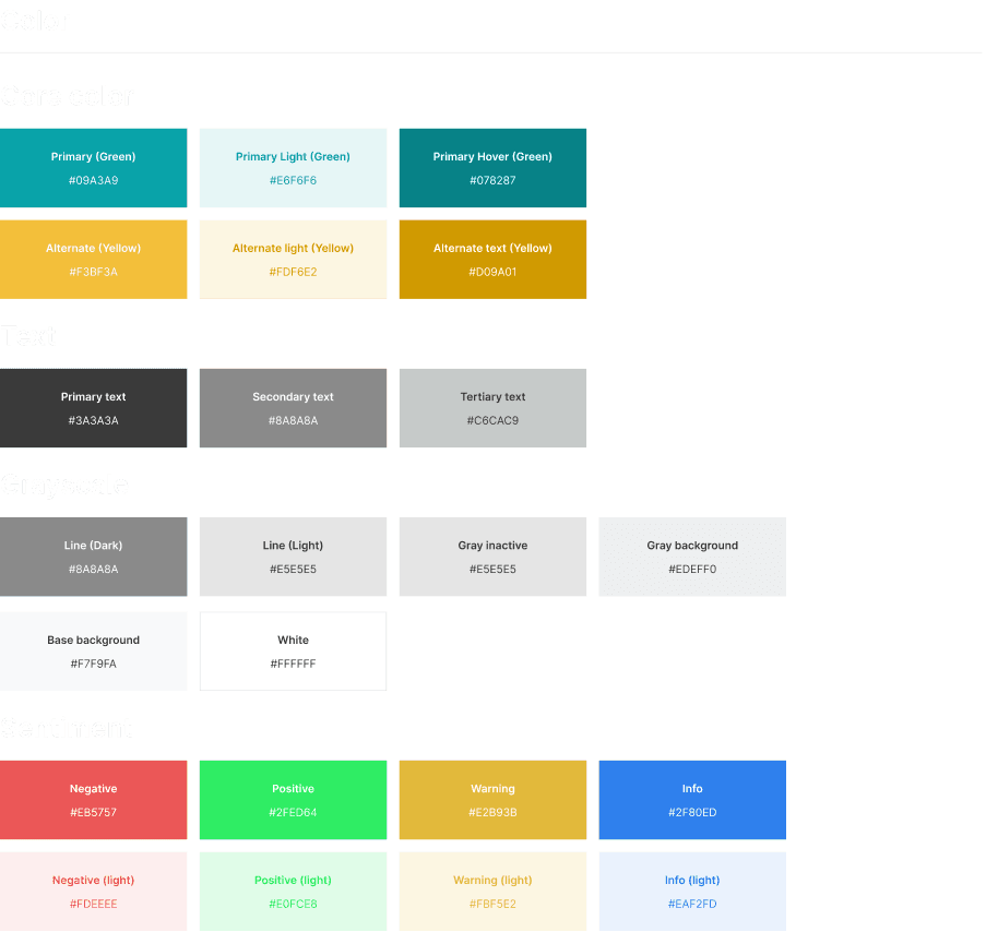

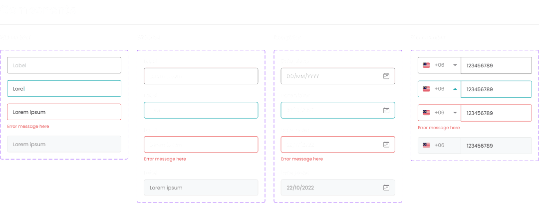
Design System
Style guide and Components
Style guide for the whole project, with a mixture of custom style guide made for certain subsections.
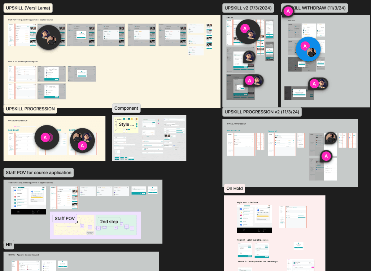
Ideation
Experiment - Sketches - Wireframes - Hi-fi
There is no wireframes or low-fi crafted because we are using existing structure. I work closely with our developers to see which components can or cant be used, This will give me a clear vision of what should be done and quickly adjust according to the requirements.
Design File.png
Final Design
Upskill
Idea Breakdown
Few iterations, discussions and experimenting, this is what we came up with.
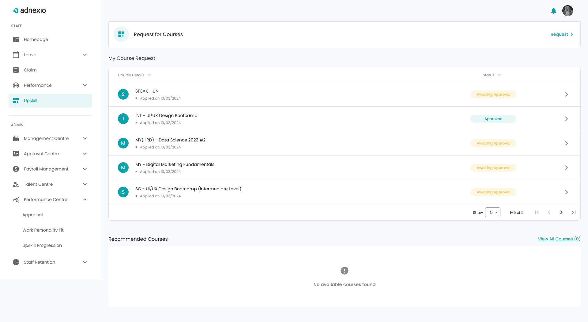
Upskill Dashboard
Rebranded with new information architecture, reorganizing side bar navigation, updated icons and some new feature added.
Choice of icon are from MaterialUI. Reasoning for that particular icon is that the 3 small squares represent “skills” and “plus” icon represent additional. Therefore, it aligns with “upskill” where it is a place for people to seek or learn new skills.
The icon on the left are meant to put the course title acronym such as Digital Marketing = DM. The idea here is for user to easily know what are the courses they are browsing at a glance. Course title on the right and below the title are the the applied date so that user can know when they applied.
These status tags allow user to quickly know the current status without having to go deeper into the breadcrumb to find out the current state of the application. There are 3 states available - Approved, Awaiting Approval and Rejected.
The idea for this section is actually related to the employee’s profile score as well as work personality. The score will affect the courses that appear at the recommended list. This is to ensure that the employee has some idea what is best for them to explore or even spark a new interest.
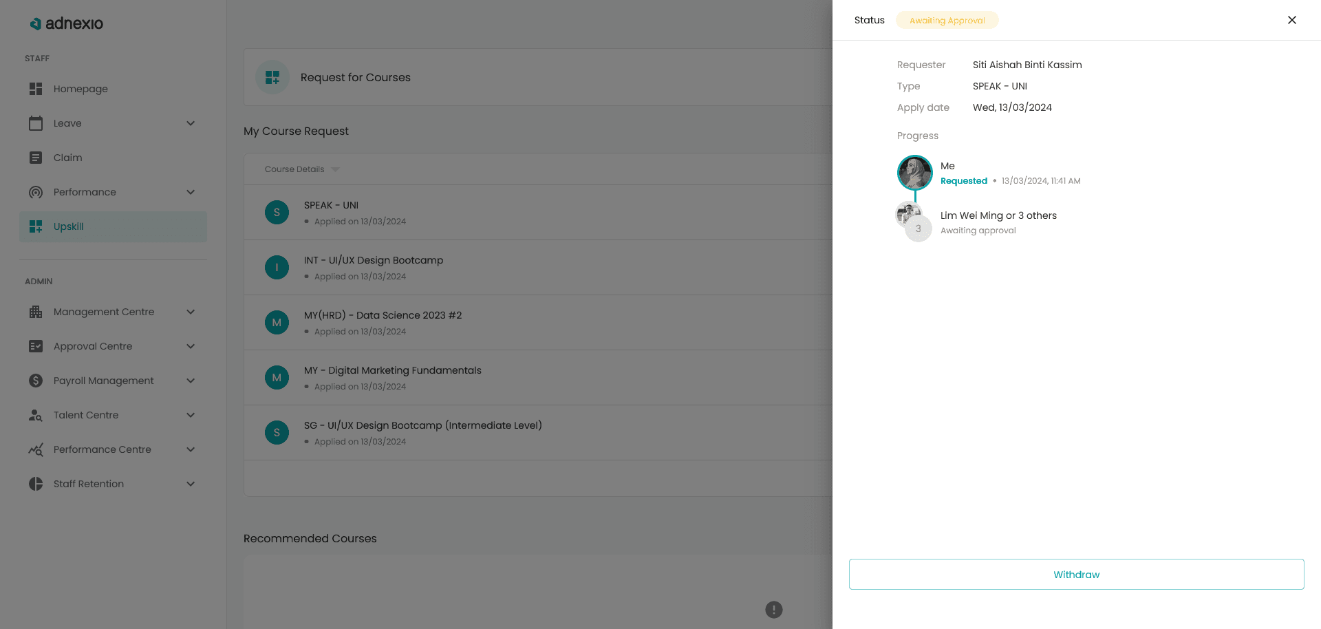
Drawer will slide from the right side when user clicked on any courses available on the list to show the approval layer and status.
Withdraw button using the secondary button type as to not encourage user to click it.
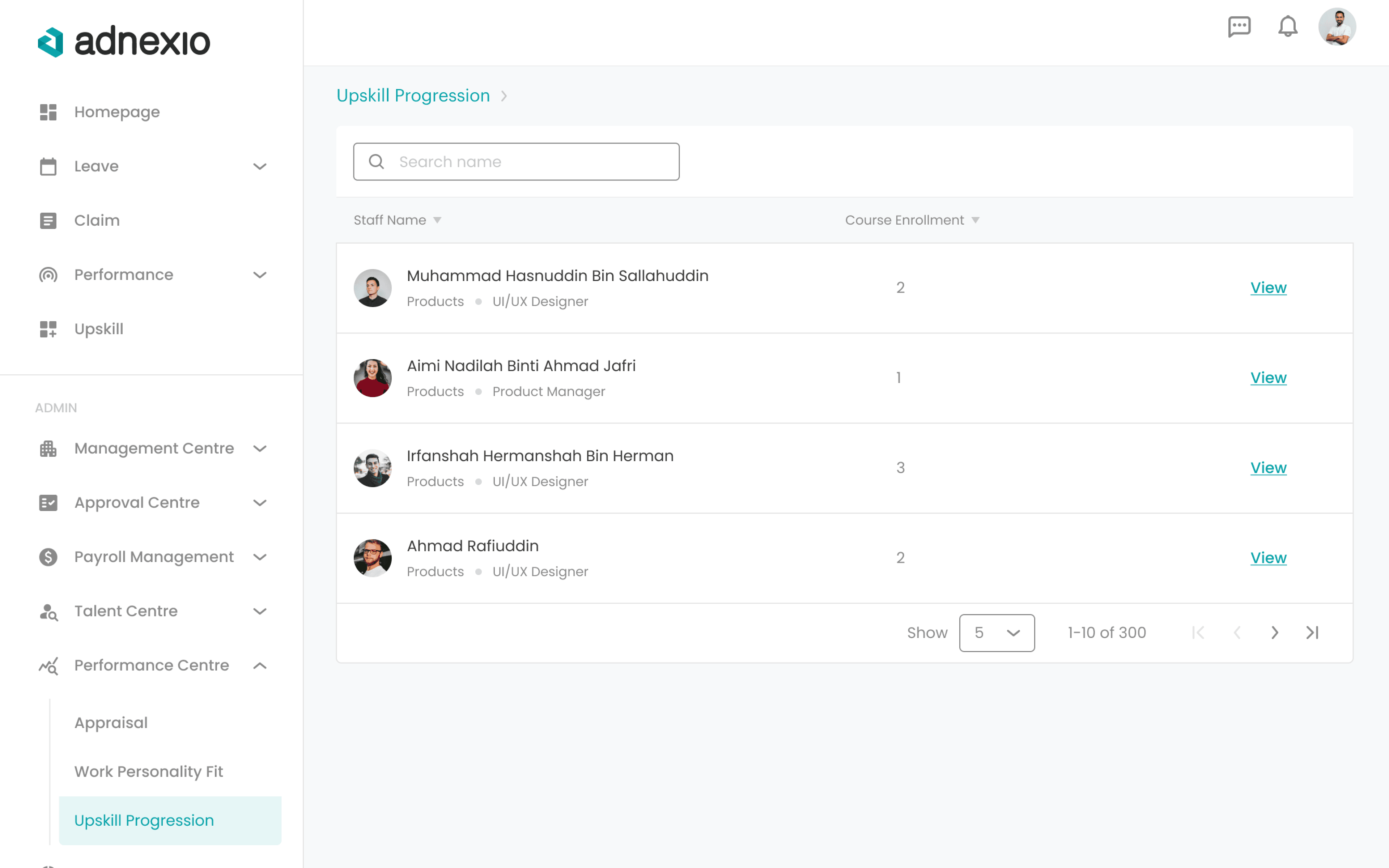
Upskill Progression
Idea Breakdown
Upskill progression are only accesible by Admin (HR). Below are the page layout.
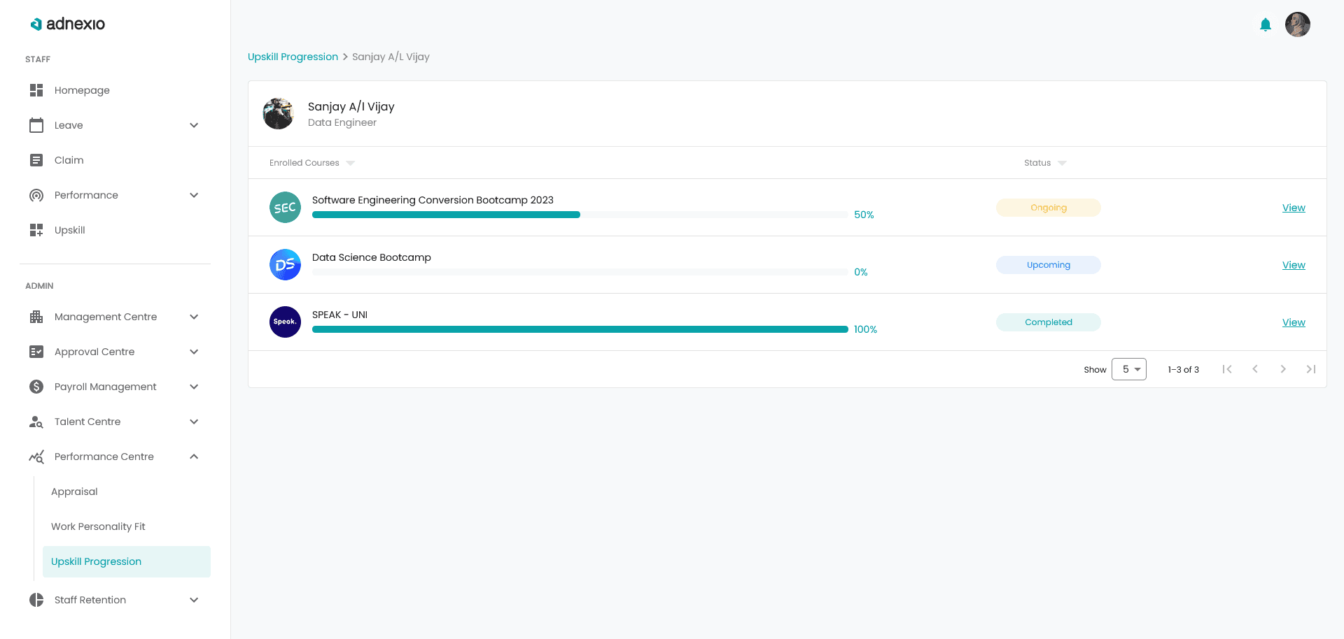
Upskill Progression Dashboard
Upskill Progression 2
Upskill Progression 3
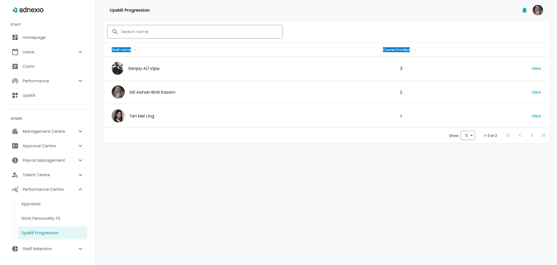
Introducing search box in any table list content are always a plus for users to easily find the desired data. In this case, admin can save time if they know who are they looking for.
A straightforward table design that tells the name of the employee, numbers of courses they enrolled and a CTA “view” for admin to check on individual details.
With the new IA, groups are made to tidy up the sub pages that belongs to the same category. Therefore Upskill Progression are grouped under Performance Centre where anything related to employee growth will reside here.
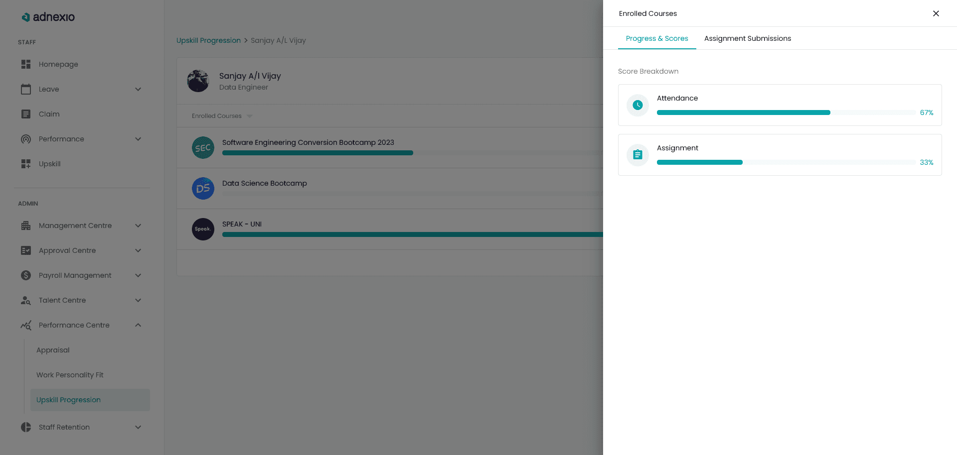
Breadcrumb are always convenient if there’s sub page within a page. In my case we have 2 sub pages (Dashboard > Individual Employee > Score Breakdown), hence the breadcrumb. Originally, we had 3 sub pages, but decided to just make it as a right side drawer to shorten the flow.
This list will show number of courses for that particular employee enrolled, the statuses as well as their score. The score meter are just to show that the employee are actively engaging in the course and their performance.
This drawer will show the details of the scoring system which is a combination of attendance and assignment submitted. Another tab is assignment submission, this is still in discussion whether should we implement it or not.
Wrap Up
What Next ?
Involving in a revamp project is fun and challenging. Through ideation process, I was able to validate and find out why and how the previous design are made and think of a better solution for UX perspective as well as UI.
I’m happy with the end result and so is the team. This project helped me improved not only my UI design skills, but also my UX research skills.
Discover More